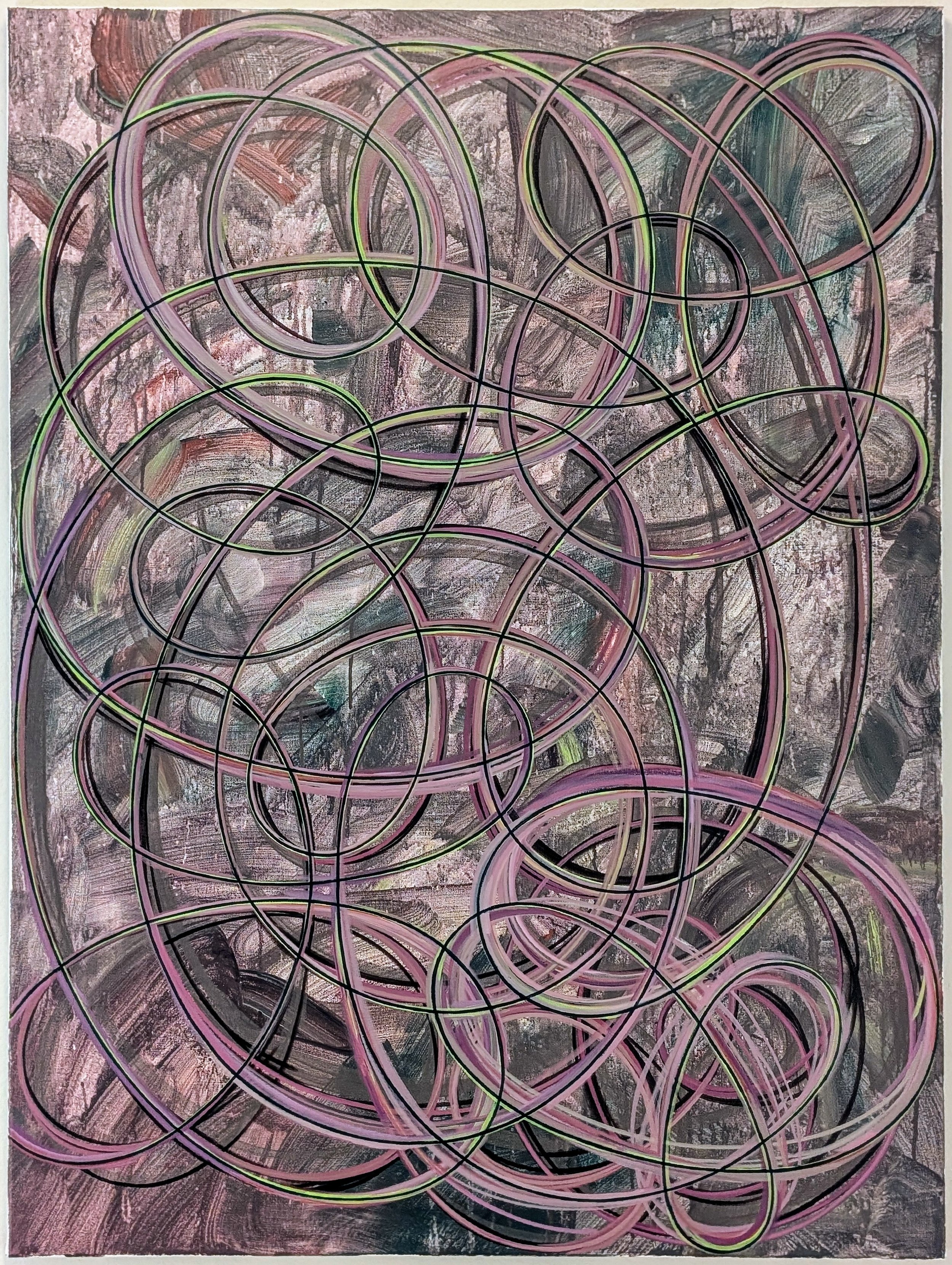
Watch the pot boil
48”x36” acrylic on canvas $987
send inquiries to russ@russbaileystudio.com
Once, in the early 90s, I found myself on a train from Ouagadougou to Bobo Dioulasso in Burkina Faso. There was a boxy tube-based tv set mounted at the front of the railcar, showing a series of Van Damme knockoff martial arts revenge movies. Afropop radio was also piping in from speakers overhead (next to a goat carcass wrapped in clear plastic on the shelf that passed for an overhead bin, but I digress). The prevailing logic was apparently that the tv needed to be loud enough that those who wanted to watch could hear it over the music, and the music had to be loud enough that those who wanted to listen could make out the beat over the punching, kicking, gunfire, and explosions. I’ve had worse experiences, but not without needing immediate medical intervention.
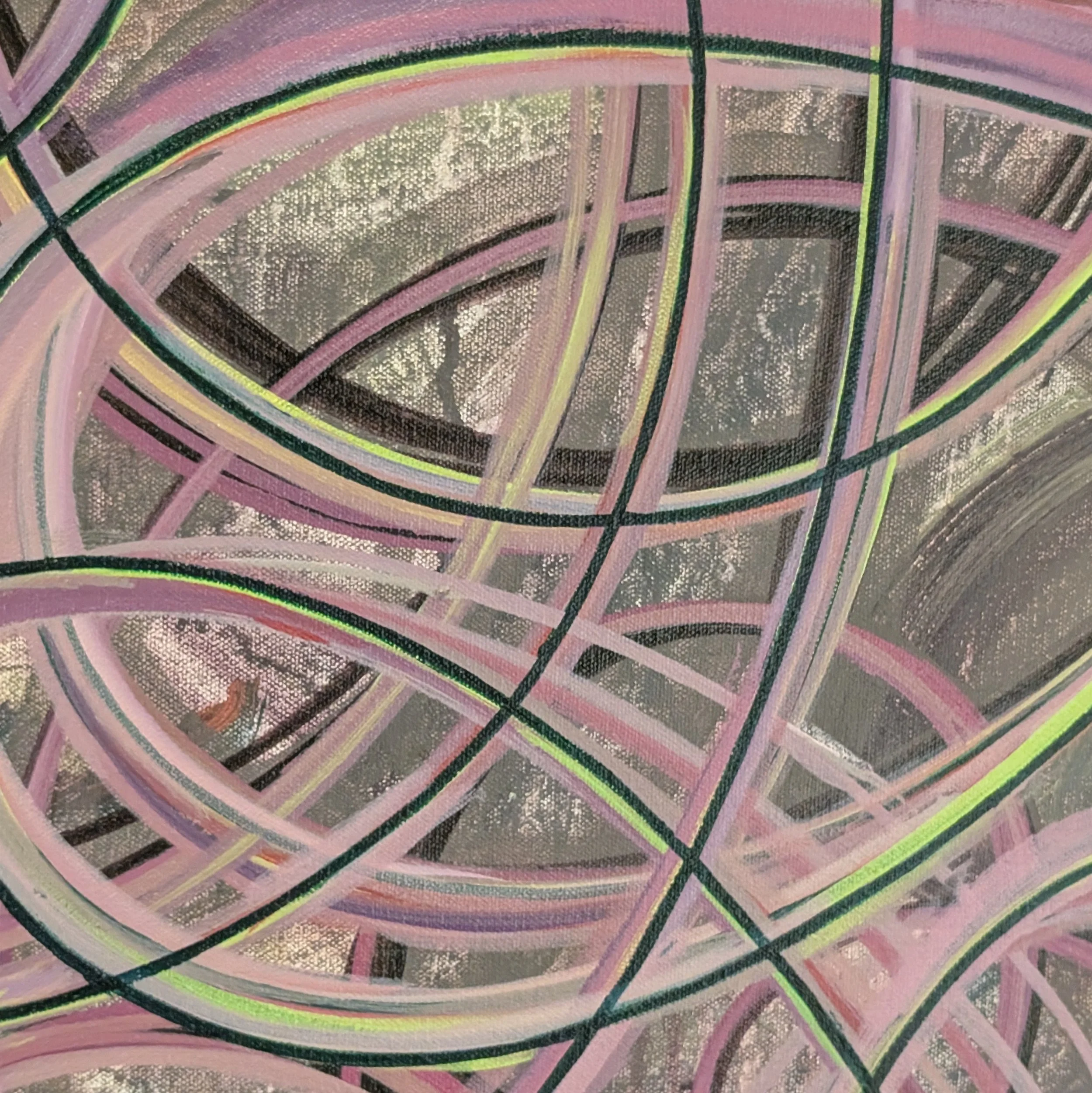
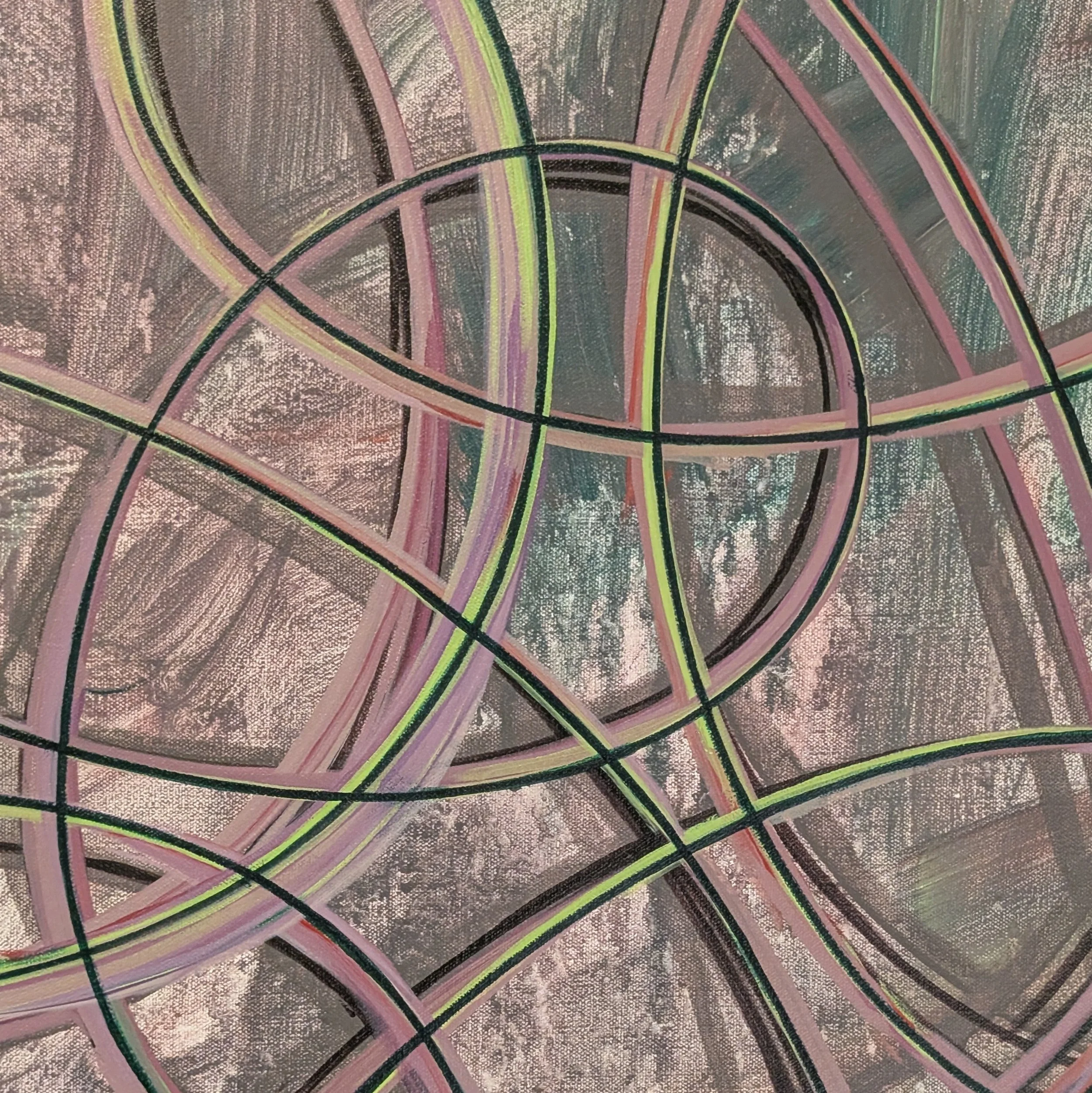
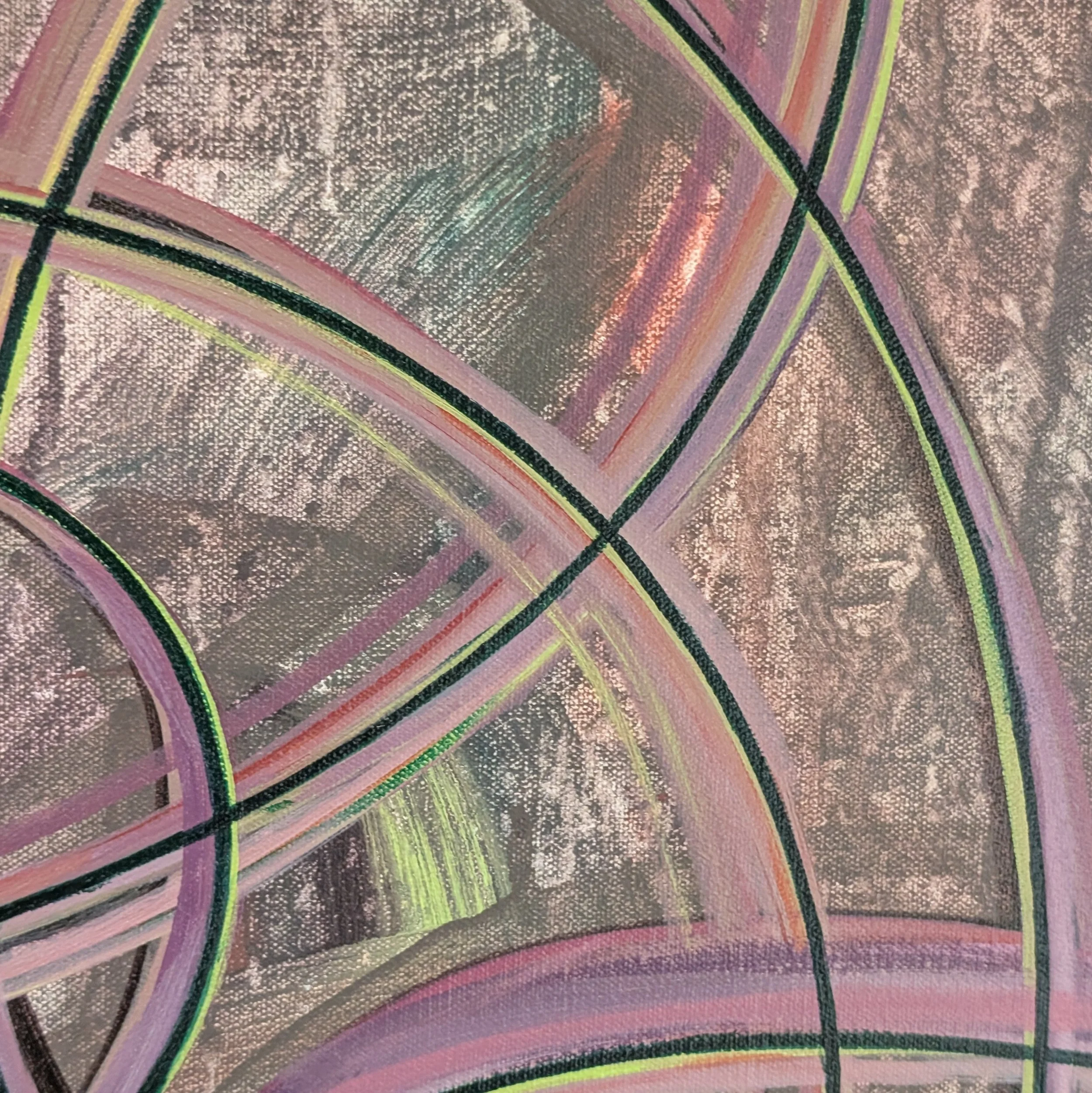
There’s a certain common type of abstract painting that juxtaposes one neon bright color with other neon bright colors, hoping for an explosion of novelty and intensity, but resulting in a sort of airless, lackluster flatness that feels like a low grade headache, like the sound profile in that train car. The effect is just a brighter and more expensive looking version of the muddy, aimless, overmixed bleakness that characterizes a lot of student work, about which I heard Brian Eno tell an interviewer:
“When I was a kid, I liked watercolor painting a lot. And I used to notice that after a day of painting, the water that I was dipping my brush into, which was, of course, a mixture of all the colors I’d touched that day, was always the same color. I called it munge, a sort of purply, browny — horrible color, basically.
And whenever I’ve tried creating things on ChatGPT — I haven’t done that much of it, actually — but I work very hard to get my prompts right and to filter what I’m saying to it and to try to urge it into something interesting.
But the color of munge covers all of it.”
I take issue only with the notion that ‘munge’ is a horrible color. I happen to love munge. No other color expresses muddiness with the same eloquence, and expressing muddiness has its place. Munge, used selectively and with intention, can convey fumbling, struggle, misapprehension, exhaustion. It is the local color of liminality, in whose company various otherwise unremarkable colors can be subtly revivified.
I had a wonderful first impression of Bobo Dioulasso. How much of that I can attribute to the nightmare of the nine hour train ride from which I gratefully escaped into the city is an open question.